Masterprojekt WiSe21
Haptic Globe: Data at your Fingertips
VR hardware such as the HTC Vive or the Oculus Rift allows the user to manipulate virtual spaces and handle virtual objects. However, when implementing real-world objects in Virtual Reality these techniques lack the ability to represent the objects weight and haptic properties, thus detracting from the immersion of the VR experience. In certain scenarios it is useful to have real haptic feedback of an object to interact with them in virtual worlds.
Extendible Prototype
All systems for this prototype interaction, object tracking, data retrieval and data visualization are designed in a very open and generic way. This makes it easy to extend those functionalities. You can for example easily add new data sources to be visualized on the globe or change the way in which you interact with the data.
The following describes our prototypical implementation with a few select data sources to showcase the features and possibilities of those systems.
The Globe
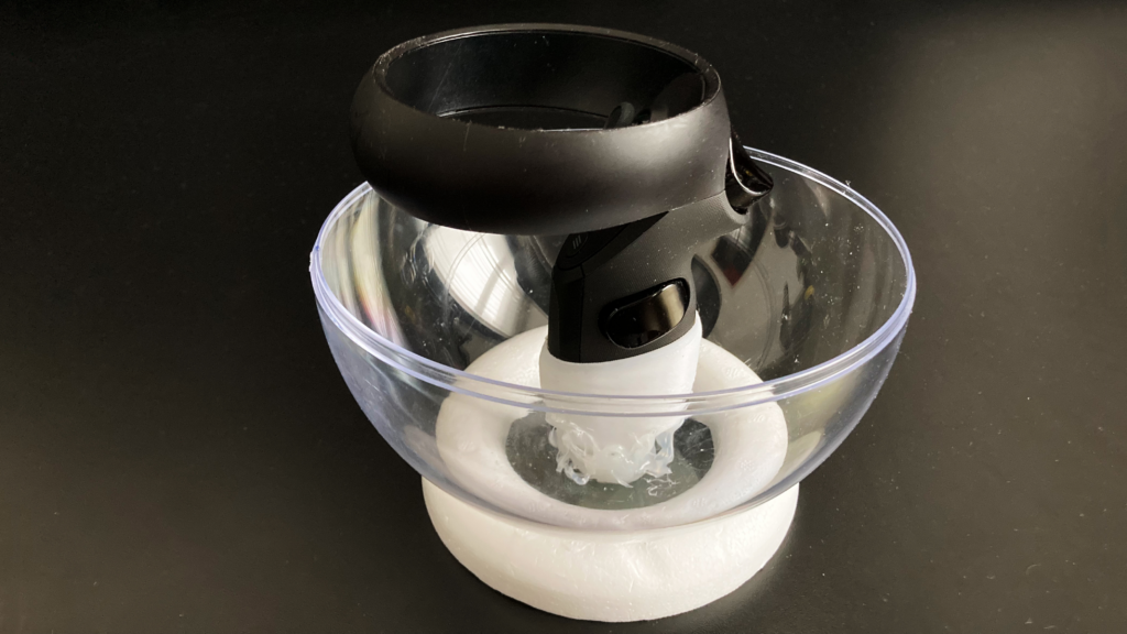
As a base for our input globe we used an acrylic glass sphere in which we attached an Oculus controller with a 3D printed mount.
In VR, the six degrees of freedom of the real sphere are represented by a miniature of the globe. We call this the control globe.
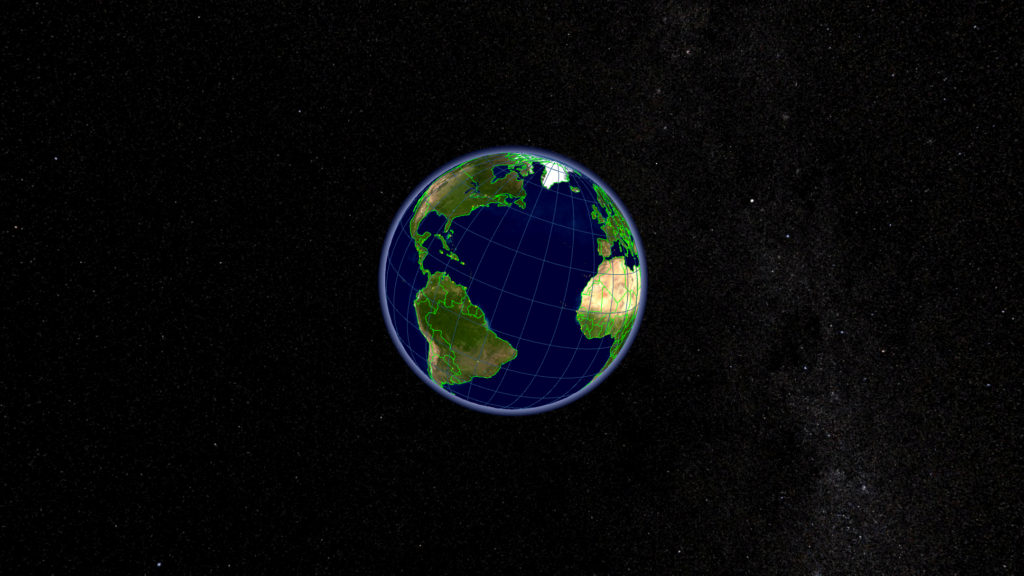
A second representation of the globe mirrors the rotation of the control globe and floats in front of you in space. This globe is much larger which allows for an easier and more detailed view on the data. We call this the display globe.
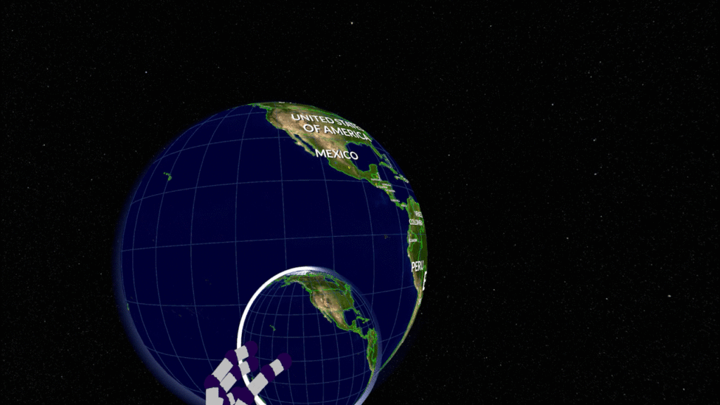
Hand Tracking
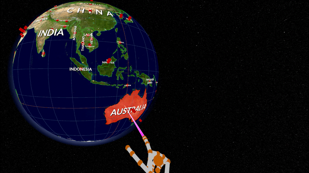
To create an immersive experience we decided to use the leap motion for hand tracking. This allows you to use your hands directly to navigate the menu and select the data you are interested in. Pointing with your extended index finger allows you to do a raycast selection. There are multiple settings to adjust the scene. You can hide the display globe, change its size, or reorient it depending on your current viewing direction.


Data Visualization
Currently three different API’s can be accessed live and visualized in multiple ways.
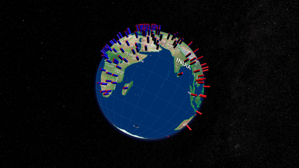
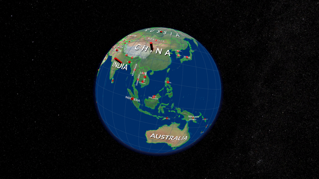
Discrete Data
A bar is placed at the center of each country. Depending on the input data it’s size will be changed. Another version of the classical bar chart. Great to show discrete data like absolute GDP, CO2 emissions or population. When split into two it’s easy to spot differences between closely related data. For example, life expectancy for males and females.
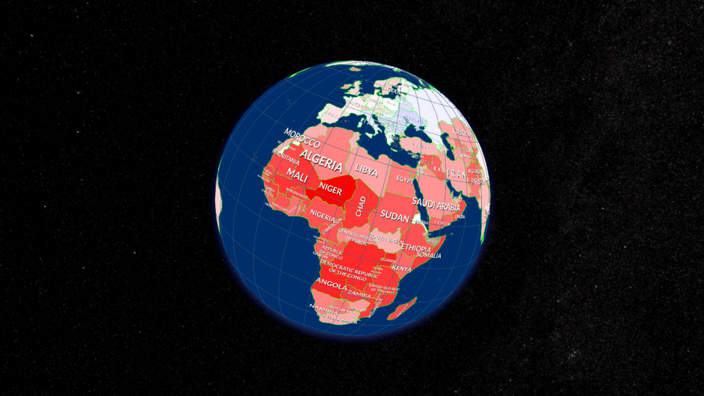
Choropleth Map
A choropleth map divides geographic areas in regions that have a specific color on a gradient in relation to a data variable. This visualization allows you to compare different countries to each other, for example GDP per capita, percentage of the population having access to electricity or population growth.
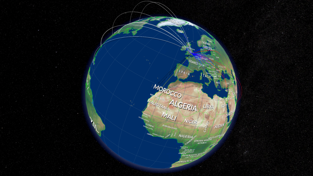
Flightdata
After selecting an airport the departing and arriving flights are visualized by a line going to the destination airport. Depending on the continent where the other airport resides, the line is colored in a different way. This so-called connection map can be used for any kind of geographical relationship or routes.
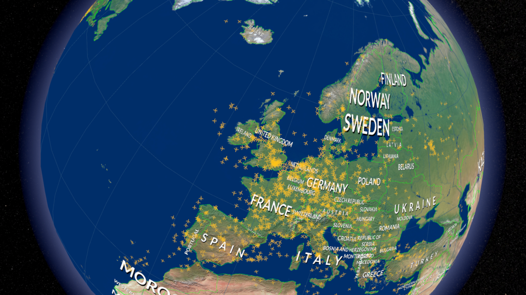
In this visualization mode all planes that are currently in the air are displayed on the globe. The data gets continuously updated at a short time interval to deliver a live view on all planes being in-flight at this very moment. This is ideal to see the distribution of flights around our planet. In data visualization this is called a dot map.
Team
- Ralf Strecker
- Katrina Rizakova
- Marino Gabel
- Arnold Holler
Betreuer
Alexander Kramer, Jonas Erhardt
Links
https://showtime.f4.htw-berlin.de/ws21/master/m6-haptic-globe